Uvumi

A true newcomer to the Music 2.0 scene, Uvumi just launched in October of 2009, and it appears to be quite promising for artists, fans, and the entire community. However, Uvumi doesn't have quite the feature set that other websites offer, though it is leaps and bounds beyond MySpace Music or any of the major label commercial media giants running sites out there (example: OurStage).

The good: Dedicated to artists and fans, and to the community as a whole, Uvumi provides a truly seamless listening experience, one which is rivaled only by TheSixtyOne. You really can browse the site while you listen to music without any interruption and without any annoying popup windows, and you really do have total control over what you listen to and how you listen to it. You can create playlists and bookmark songs, and the daily popularity charts are a great way to discover new music. Song genres are determined by tags that listeners define for each song, so instead of just one person, or the artist, deciding which genre each song is, it is based on what the entire community thinks, which is an interesting and different way of approaching the situation. Also, playlist creation and management is super easy, and really cool, as they don't seem to enforce any limits on how many songs or playlists you create.
Best of all, at least for artists, Uvumi has a tool called Uvumi Press Kits. It lets artists create very nice PDF press kits that they can use like a standard EPK or they can print them out and hand deliver them, old school style, to venues, radio stations, and other contacts. And, incredibly, the press kits have no branding at all, which I actually think is quite amazing. If you have ever seen a sonicbids EPK, then you should appreciate what it means to have no branding: artists can present their press kit as their own creation, without having to have some company's logo plastered all over it. This tool is unlike anything I have ever seen for press kit creation, and the fact that it's free is a really great value for indie artists.
The bad: Boring to look at. From a graphic design standpoint, there's not much going on there. But then again, this might be good because it brings more attention to artist content instead of flashy interface design. Another thing that is really lacking is proper music discovery tools. The charts are great, and if you make friends and become a fan of lots of other members, you'll get status updates about the songs those people like, playlists they create, etc. You can view other users' listening history, too, which is a nice way to explore, but it's not very easy to find and you really have to dig around to discover new stuff that might not be on the charts or in peoples' playlists.
All in all, this small project out of Austin, Texas, has a lot of potential, I will be keeping an eye on them to see what they do in the future.
Grooveshark Summary:
- Music source: Independent artists
- Platform: AJAX, no flash
- Target Audience: Indie fans, indie artists, and underground music addicts
- Seamless Music Player: YES (no popups!)
Our Stage
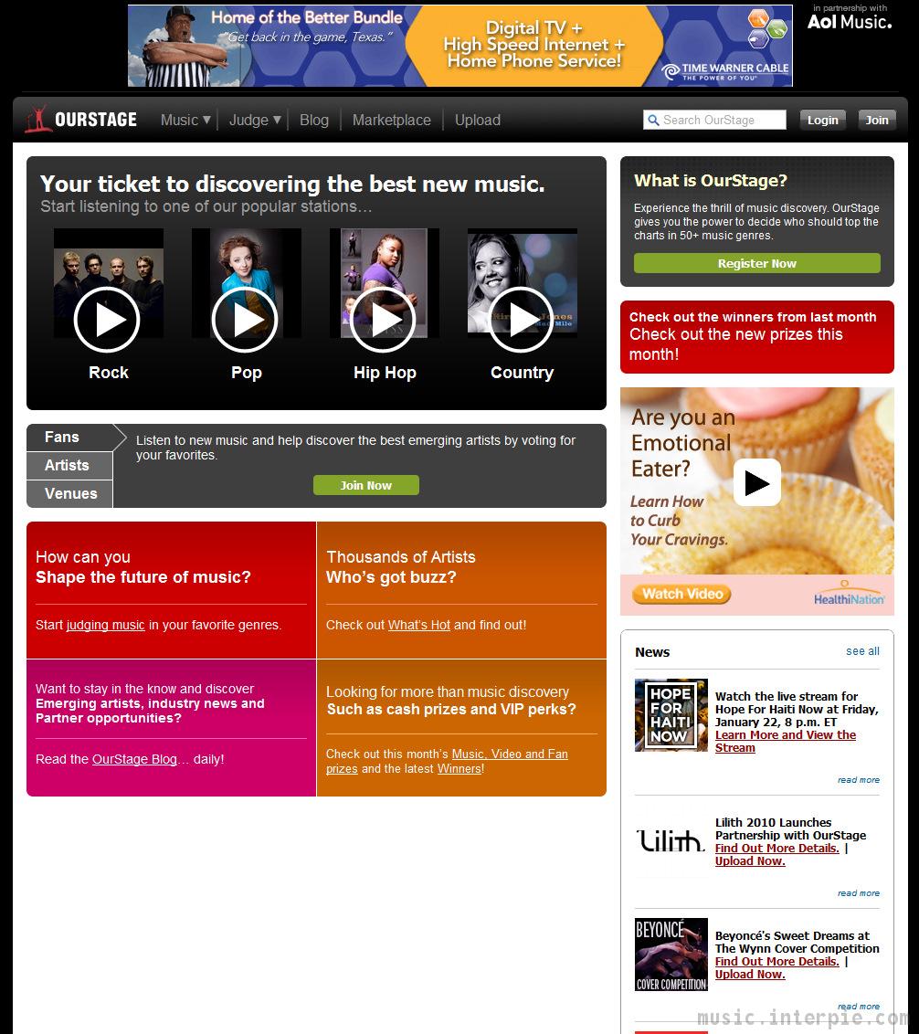
The first thing you'll notice when you arrive at OurStage.com is an icon in the upper-right hand corner that says "in partnership with AOL Music." This should be your first signal that the website is going to be chock full of mainstream music and very annoying animated advertisements, which of course it is.

Next, if you can look past those annoying, flashing, distracting ads, you might click around and find that you can play music, of course. BUT, it requires you to allow a pop-up window with the player in it. If you don't enable that popup in your web browser, well, you can't listen. The more you cruise around the website, the more boring it becomes, and the more you'll want to head over to something else, like TheSixtyOne or Uvumi, where you can listen to music without popup windows and without a major corporation shoving popular crap down your ears.
Now for some good things (not really): They have a lot of music, though it is not easy to browse at all. You can get to a genre page, but there are only 14 total artists listed on each page. How can you see everything and freely browse? You can't. You can click a link to "Show More", but then you just get one page of artists, with no way to see more. Here we are with yet another example of a major media conglomerate deciding what you should listen to instead of giving you the freedom to browse around for yourself.
One thing that is kind of cool, but still not very helpful to the music community, is the Judging area. If you end up on this part of the website, and if you can (again) ignore the very distracting animated advertisements plastered all over the page, you'll find an interesting interface where can listen to two songs side-by-side, and rate which one you like best. While this is kind of fun, it seems more like a trick to get data about visitors' likes and dislikes than a feature that adds any value to the artists being judged or to the user experience.
When it's all said and done, you'll probably click away from OurStage feeling a bit dirty, perhaps soiled by the filth of corporate greed and artist exploitation, and you might also feel belittled by Aol's attempt to force-feed you content that they think you should like instead of giving you the freedom to explore and listen on your own.
Sorry, that was a pretty brutal review of OurStage.com, but come on folks, it's a terrible website that adds little, if anything, to the overall music community. Correct me if I'm wrong, please!
OurStage Summary:
- Music source: Major Record Label Catalogs and independent artists
- Platform: Standard HTML website
- Target Audience: Mainstream followers, MTV viewers
- Seamless listening: No
Sellaband
 SellaBand is a pretty cool idea. Basically, artists sign up to try and raise funds from fans so they can produce a record, go on tour, buy new instruments, or fund that new kegerator
This is a really cool idea because it fully embraces the fact that the current marketplace for bands and musicians is a different world than it was a decade ago. SellaBand has actually enabled dozens of bands and artists to record CDs and plan big tours to build their individual brands in a competitive market. Of course, they have to make a buck on the side, so SellaBand collects 10% of the target amount that bands raise, which may seem a bit steep, but hey, gotta pay the bills, right?

Right, but that's not the only way they are making money from this idea. They also have a music store where you can buy MP3 songs for $0.99 each, and presumably they take at least 10% of those sales. Furthermore, they run ads all over the place, which is fine except for the fact that they also take a cut of all the money that goes through their platform. You know what would be really nice? If they stopped running advertisements so the website could be a lot cleaner, more direct, and maybe look a little less like a vehicle that was built specifically to make a profit. Do we really need to see a huge banner of "Partners" at the bottom of every page on the site?
Anyway, SellaBand is a platform to help artists raise money to advance their careers. But does it work? Supposedly, yes, it does work sometimes, but you probably haven't heard of it because of the shortcomings of the website itself. Specifically, there is no technical advantage of SellaBand.com over Facebook, or even MySpace, in terms of the interface and layout. Sure, it looks clean, and it navigates nicely, but it is missing any type of seamless music player, playlist support, and robust social networking features.
When it comes down to it, SellaBand is a fantastic concept, and we recommend visiting this website if you like the idea and want to help budding artists make it in the new music marketplace. If nothing else, you can see a radical concept at work in the new era of Music 2.0.
SellaBand Summary:
- Music source: Independent and unsigned artists
- Platform: Basic HTML website
- Target Audience: Indie fans, music consumers, die-hard fans with money


 Subscribe